Build in preview theme contains css elements with !important attribute

Problem

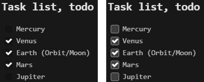
The build in theme (in app.asar) contains css elements with the !important attribute. Therefore it’s not possible to overwrite css for those elements within custom theme. I would like to change e.g. opacity of checkboxes (for task list).

Extract from build in style in app.asar:

.ui.checkbox input[type="checkbox"], .ui.checkbox input[type="radio"] {
    ...
    opacity: 0 !important;
    ...
}

Reproduce

Try to change styling of input type checkbox in a preview theme.

Question

Is there a workaround or a solution?

Kind regards
Nicolo

Hi Nicolo,

Thanks for the question.
Inkdrop’s UI components are based on Semantic UI which is a beautiful CSS&JS library for modern web like Bootstrap.
Semantic UI uses !important for some components as you mentioned.
You can find where to change by searching files in <your-theme-root>/src/.

For example, the style for .ui.checkbox[type="checkbox"], .ui.checkbox input[type="radio"] is defined here: https://github.com/inkdropapp/inkdrop-default-light-ui-theme/blob/master/src/definitions/modules/checkbox.less#L50
You can strip the !important directive here.

Hope this helps!

Here is a tip for checkbox customization:

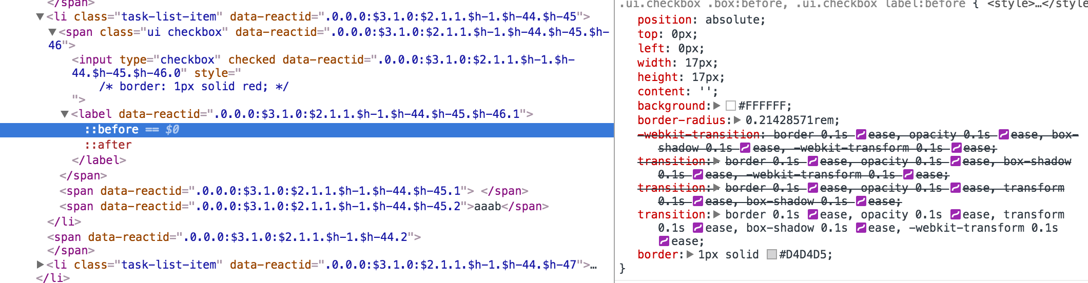
The checkboxes are hidden by default.
Because if you changed opacity of the input[type="checkbox"], you get the system default checkbox and it is not customizable.
To avoid this problem, in Semantic UI, the actual appearance is defined with .ui.checkbox label:before.

So you should be able to override CSS with following selector: .mde-preview li.task-list-item .ui.checkbox label:before.

Hello craftzdog

Your tip made it.

I added in github-makrdown-dark.less this …

...
li.task-list-item .ui.checkbox label:before {
  background-color: lighten(@bg, 15%);
  border: 1px solid lighten(@bg, 50%);
}
...

…which changed the task list preview this way:
2018-02-01_07-53-15

Thanks!

1 Like

Cool!